 Major League Baseball prides itself on the jerseys worn by its teams. All 30 teams have three or more jerseys that they wore in 2014, some of them even have over 10. Some jerseys do a great job representing their teams, while others should be discontinued immediately. Within the past few seasons, ball clubs have gone crazy changing their uniforms, and most have developed a modern/classic look to be worn by their players. Obviously, this is done for marketing purposes, so they can sell more merchandise. But which team has the best? Here is a list of the rankings of all 30 teams based on the jerseys they wear:
30. San Diego Padres: A nice makeover so far this season on a roster standpoint, but the jerseys still need a lot of work. The Padres look is outdated, and ugly to the point that bringing back the mustard yellow and brown jerseys would be a good idea for the organization to consider. Although they are meant to support the military, the camouflage jerseys should be retired or redesigned immediately.
29. Houston Astros: The Astros and the Marlins fall in the same category for jerseys: confusing. The Astros have white, grey, and orange jerseys that are worn on a regular basis, all of which are ugly. The block lettering of the jersey’s text is distracting. The team should go back to their pinstriped/outer space-esc design.
28. Miami Marlins: First of all, the Marlins have too many different jerseys that they wear throughout the season, which has led to an uneven distribution of how they are worn. The Marlins’ jerseys have been terrible since the day they moved to Miami, mostly due to the fact that they look more like soccer jerseys than baseball.
27. Texas Rangers: Red, white, blue, and grey: these are the colors of all the different Rangers jerseys. At a glance, the jerseys are not too bad, but when looking at them for more than a second, they become very unappealing to the eye. They worked when C.J. Wilson was on the ball club and wore a different color glove every time he pitched based on the color of the uniform worn that night, but now they are in need of a makeover.
26. Minnesota Twins: The Twins jerseys have not been nice for years, and this year they have become even worse. For some reason, the organization decided that they would add golden, sparkly shadow to the text on the uniforms, which makes the jerseys even more unappealing. As for the other jerseys, the pinstripes are decent, but the away jerseys with the slanted “Minnesota” text need to be remade.
25. Seattle Mariners: Although they are number 25 on the list, the Mariners may as well be the team in biggest need of a makeover. The blue-green, blue, white, and grey jerseys are all too 1990’s, and need to be updated to fit the modern eye. The best jerseys they ever had were the ones with the trident, but there would be no point in trying to bring back that look.
24. Cleveland Indians: The Indians have a nice, retro-type look to them, but there are certainly improvements that need to be made. There are complaints that Cheef Wahoo is not the most sensitive image. If the organization feels the need to replace him, they have to find something better than a block “C” on the caps.
23. Arizona Diamondbacks: The Diamondbacks have an interesting style to their uniforms with the dark red and “horror movie” looking font, but the uniforms just do not work. They look like something out of a video game, and are too cartoony to be worn by grown men. Also, the team name is so long, so they have to put “D-Backs” on the home jerseys, which they should replace with a simple “Arizona” just like the one on their away jerseys.
22. Milwaukee Brewers: In 2014, the Brewers wore a total of 10 jerseys, and finished with a record north of .500 while wearing only three of them. None of the jerseys are good looking, and only one of them says “Milwaukee” on it, which is odd due to the fact that the team seems to be proud of their city. The Navy blue and the gold jerseys are not pretty on the eyes, so the team should stick to just white and grey as their primary jerseys.
21. Washington Nationals: There is no team more patriotic than the Nationals and rightfully so. By calling the nation’s capital their home, the Nationals do have to stick with the red, white and blue theme. But honoring our country and wearing the nation’s colors does not automatically mean that it makes a good uniform design.
20. Los Angeles Angels: The Angels have nice white and grey jerseys, but when it comes to their red jerseys, the whole look goes downhill. The team wears the red jerseys for both home games and away games, and both look equally awful. The jerseys are red on red with a white outline on the numbers and text, and it truly takes away from the look of a team from one of the greatest cities in the United States.
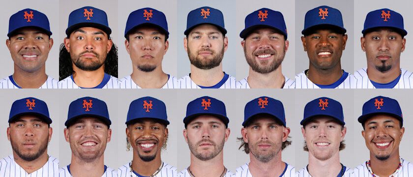
19. New York Mets: The Mets will enter 2015 with five jerseys, one of which will be new. This will mean they will have two blue, one camouflage, one grey, one white with blue pinstripes, and one solid white jerseys to go with four different caps. The Mets lose points due to their camouflage jerseys, because that is a look that cannot be made good by any team.
18. Pittsburgh Pirates: A Pittsburgh team with gold, black, and white as their primary colors…sound familiar? Yes, all Pittsburgh sports teams have the same primary colors, but none of them pull it off quite like the Pirates do. However, the jerseys could use a remodeling to better fit the twenty-first century, which would put them higher up on this list as well.
17. Tampa Bay Rays: The Rays jerseys are nice, but also somewhat confusing. The cartoonish look of the uniforms takes away from the design, but the oddest part of the jerseys is the starburst on the “R”. This leads to some confusion when looking at the logo, because it drives fans from thinking of the Rays as the fish to thinking they mean rays of sunlight. Also, although the light blue jerseys are nice, the navy blue jerseys with navy blue writing needs to go.
16. Colorado Rockies: The Rockies may not have the greatest jerseys, but they certainly are unique. For a newer team, the jerseys worn by the Rockies make the team look like they have been around for a few more decades than they actually have been. Also, the purple, is a look no other team would be able to pull off even if they tried too.
15. Atlanta Braves: A rebuilding team with a closet full of jerseys that do not need to be touched. Other than the red-based and navy-based jerseys, the braves have great jerseys to wear, most of which display the Tomahawk Hammer underlining the team’s name. To go along with these jerseys, the Braves have two main hats which they wear, both of which are equally as perfect as one another.
14. Philadelphia Phillies: The Phillies are another rebuilding team with one thing going for them…their uniforms. All three of the Phillies primary uniforms are great, but each of them does have their flaws. The red pinstripes may sound like a good idea, but when put to use, it makes the uniform look too much like a Christmas outfit. Also, the font used for the numbers could be a bit more modern, but all in all the uniforms are spectacular.
13. Kansas City Royals: The defending American League champions have four primary jerseys that they wore in 2014, three of which were as beautiful as the next. Powder is a look that few teams could pull off, and the white/grey jerseys are classic. However, the navy blue jerseys could be thrown away in a heartbeat, and would not be missed one bit.
12. San Francisco Giants: In 2014, the World Champs had four jerseys they wore on a regular basis: two for home and two for the road. The Giants’ main home jersey and main away jersey are both amazing, but their alternates could use work. The orange home jerseys are both ugly and confusing, while the SF away jersey looks like the team is trying too hard to create a modern, yet classic, jersey. Get rid of those two jerseys, and the Giants may find themselves higher on the list.
11. Detroit Tigers: The Tigers have two nice jerseys, but the home ones are very confusing. The away jerseys they wear are a nice mix of grey, orange, and navy blue; while the home jerseys are a great classic look with an English D on the chest. However, on the home jersey’s “D”, the two lines in the middle of the letter curve away from each other, while the hats they wear have the lines curving toward each other. It should not be that hard for the organization to chose one style for the letter, and if they do…they will easily find themselves in the top 10.
10. Cincinnati Reds: In 2014, the Reds wore seven different jerseys, three of which were only worn once. Out of those seven, two of them are classics, but even they need a little work. The Reds still seem to be stuck in the early 2000’s with the shadows behind the letters and numbers on the jersey, and they need to go away. Also, the shadow is behind the letters on the logo of the uniform is a bit awkward looking, and it needs to go immediately.
9. Los Angeles Dodgers: Since moving to Los Angeles, the Dodgers’ jerseys have gone virtually untouched. In 2014, the Dodgers wore three jerseys (not including the holiday jersey they wore just once all season): home white with “Dodgers” written on the front, away grey with “Los Angeles” written on the front, and away grey with “Dodgers” written on the front. All three of these jerseys are perfection, and there is no reason they should not be in the top 10.
8. Baltimore Orioles: Last season the Orioles wore 10 different jerseys, and 13 different hats. However, they were able to make it work, mostly because about half of the hats had the cartoon bird displayed. Ok, so the bird is not on the jerseys, but it still does wonders with making the team’s look different and stand out from all the rest. As for all the different jerseys, they all have the same basic concept, but are just different colors.
7. Toronto Blue Jays: When the Blue Jays first announced their new look a few years back, it took a little while getting used to, but now it is one of the best looks by far. The modern classic look is phenomenal, and all five of the jerseys show just how proud the team is to be from Canada.
6. Chicago Cubs: 14 jerseys were worn by the Cubs last season by a ball club celebrating 100 years of playing in Wrigley Field, and for the most part…they were beautiful. The classic pinstriped look with the Cubs’ C on the chest is a look for the ages, and so is their road “Chicago” jersey. However, their other two primary jerseys need some work. The blue jerseys look too much like a little league jersey, and the away jerseys reading “Cubs” on the front need to go immediately. Either way, the Cubs certainly have one of the best jerseys in all of baseball.
5. Boston Red Sox: The Red Sox primary home and away jerseys are beautiful, and certainly deserve to be in the top five of this list. They could even be in the top three of the list, but the home red and away blue jerseys are certainly holding them back. Both jerseys are too colorful for such a classic team, and neither fits the modern, yet classic style the organization should be going in.
4. Chicago White Sox: Ok, so the name of the ball club does not exactly make sense since the White Sox are always wearing black colored socks, but the jerseys that they wear are some of the best in baseball. The classic home pinstriped look, the classic grey away jerseys, and a beautiful black home alternate jersey all look great and exemplify exactly what a baseball uniform should be. The only thing holding them back is the odd green jersey that they wore once in 2014, because as interesting as it is, there would not be a single tear shed if the team got rid of it.
3. New York Yankees: Ever since they were organized, the Yankees have not gone through too many costume changes concerning their uniforms. The ball club only has the classic pinstriped home jersey with their NY logo on the chest, and a grey away jersey with “New York” written on the front. Also, the Yankees have not added the players’ names on the back of their jerseys, which gives the look an even more classic style and makes sure that their fans know who is at the plate without cheating and looking at their back.
2. St. Louis Cardinals: Another classic team with a classic look, the Cardinals have one of the best arsenals of jerseys in all of major league sports. On all of their jerseys, the Cardinals have their classic bat with two birds across the chest, and whether the chest says “Cardinals” or “St. Louis” the look always seems to work. To go along with their jerseys, the Cardinals also wore 10 different hats last season, all of which looked just like a hat that should be worn by a major league ball club.
1. Oakland Athletics: That’s right, the number one jersey in all of baseball belongs to the Athletics. The jerseys are an original blend of green, yellow, and white, which is a look that can only be pulled off by a team under the helm of one of the most “original” general managers in all of sports. The A’s have both a green and yellow based alternate jersey with “A’s” written on the chest, and two classic primary jerseys that they wear on a regular basis. There is no doubt that the Athletics have the greatest jerseys in all of baseball, and may even have the best in all of sports.
There you have it, all 30 teams with their uniforms ranked in order of how they look…what better way to break in Spring Training?
I remember a few years back when the Nationals had their jersey’s appear to be spelled “Natinals.” One of the few times when a team really messed up their jerseys.
I’m surprised at #1 and #4.
I’ve always liked the orange/black of the Orioles and Giants. I prefer the real bird to the cartoon bird, though.
Far and away my vote is that the Cardinals have the best unis. They are so seriously thought through, that it shows the legendary pride in the team I’m so envious of. They are also one of the last teams to actually chain stitch their logos on the jersey. They also recognize the past by being the only team that still hand chain stitches each players name on the tail of the shirt. If you see a Cards jersey up close then read about their care it becomes clear why that is just another example of the amazing “Cardinal way”.
Here’s some great reading:
http://www.uni-watch.com/2012/11/29/talking-uniforms-with-cardinals-president-bill-dewitt-iii/
And up close, the chain stitching is absolutely amazing:
http://static.flickr.com/95/274641310_de1a4529f7_o.jpg
Agreed, I think the White Sox needs some 80s magic back in their design. The new Twins jersey looks like a minor league team. I noticed, of course, that the older teams were higher on your list. I’m very surprised the Mets are so low, as they often have some of the best uniforms going. They were one of the first teams to have a black jersey alternate, unless I”m mistaken. The orange and blue is getting a little too bright, but they are still in the top 10 or so.