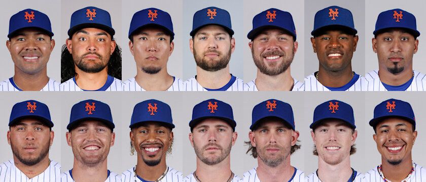
 By now you have noticed the new logo and header atop of our home page. I liked the old logo a lot but with Jose Reyes no longer around, I just did not want to be reminded of him on a daily basis. So the challenge came up to create a new logo with no technical skills.
Mike Koehler suggested that I try a friend of his, Dave Stark, and I’m glad I did. Dave has a Bachelor’s of Fine Art from the University of Buffalo. Currently, he works for McGraw-Hill and has experience with many other newspapers and magazines doing layout ad design. He has also done freelance work for various different companies/organizations from local bands to international groups.
When I asked him what it was like to work on this project, Dave said, “Working on the logo/banner was a lot of fun. It brought back a lot of old memories of some of my childhood favorite players along with stories my dad tells me about others like Swoboda and Koosman. Also after spending much of the offseason hearing from the media and my in-laws (who are Yankees fans) about the problems the Mets have, it helped me get excited about the upcoming season and reminded me why I have loved the Mets for as long as I can remember.”
If you want to see more work by Dave, check out http://davestarkdesign.carbonmade.com/
or dstarkart.wordpress.com.
If you like the banner and would like to hire Dave for a freelance job, you can reach him at [email protected]
Finally, I would like to thank Michael Baron from MetsBlog for his contributions to our new header.

Nice work, Dave!
Thanks Brian. And thanks Mike for helping to set it up.
Dave, that looks amazing. Kudos!
Great stuff!!
That looks fantastic! Love it!
Love it, although all available evidence suggests that I’m partial to cards. Nice work!
Thanks everyone. Glad you like it.
[…] and banner created for http://www.mets360.com They also put a really nice write-up here https://mets360.com/?p=9211 #gallery-1 { margin: auto; } #gallery-1 .gallery-item { float: left; margin-top: 10px; text-align: […]